Dashboard
Domestic Airfare within the U.S
Year
2025
Category
Data Visualisation
Medium
Interactive Map
Location
Chicago, USA
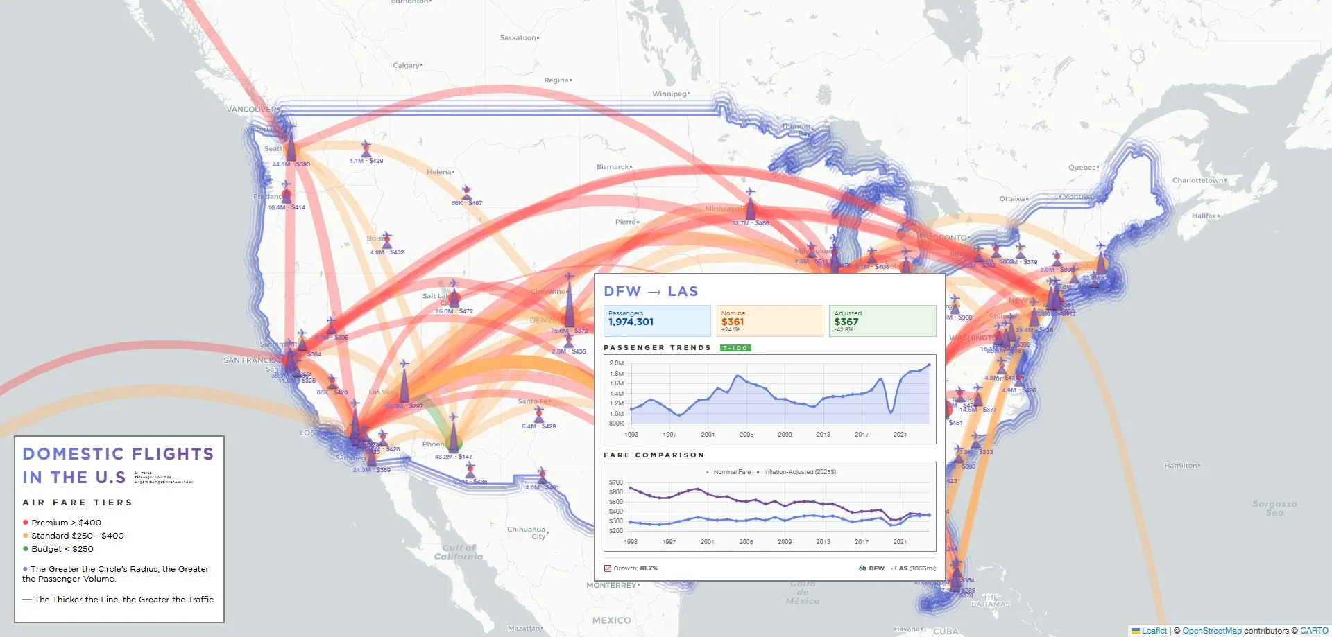
An interactive map visualizing airfares amongst the top 100 busiest airports and the top 200 busiest airlinks in the United States between 1993 and 2025. Users can explore price fluctuations across routes and time periods, revealing patterns in deregulation, fuel prices, and competitive dynamics across American aviation.